 |
|
 |
||||||||||||
COVID-19 Discussion
I have posted comments on Facebook and email regarding COVID-19 since the pandemic's beginning. Below are a sampling of those comments in reverse chronologial order.
October 19, 2020 / email
It's been awhile since I've heard anyone say, "Yeah, but the flu kills more people." The flu's pretty deadly, but not nearly so as COVID has been this year.

Probably the best measure of COVID's impact is comparing 2020 total deaths to average annual deaths the last five years. Reliable data runs a couple months behind, so here's the chart through August 9. Through that period, deaths were up 15.2 percent. The majority of the increase is attributed to COVID. The additional deaths may be unattributed COVID deaths, or other deaths due to the lockdown.

This is, by far, the most compelling chart (which I've never seen done before). The chart plots COVID deaths per million versus GDP decline during the first half of the year. The United States, Sweden and India are outliers. Australia, which many Americans consider close cousins, is the clear winner here.

October 13, 2020 / email
COVID is becoming much less lethal. Here's a chart plotting deaths as a percent of total cases averaged since April 1. Before that the data was inconsistent. A better analysis would be deaths / hospitalizations.

September 2, 2020 / email
For my monthly COVID update, I've added several new parameters, including the county's political orientation. (The report analyzes COVID death rates by race, income, age, population density and political orientation.)

August 3, 2020 / email
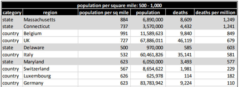
Today, President Trump criticized Dr. Deborah Birx for claiming the United States is entering into a new COVID-19 phase and that the virus was extraordinarily widespread. Ranked among 215 nations, the United States ranks tenth in deaths per million. But the United States is a huge country ranging from densely populated states such as New Jersey and Rhode Island to sparsely populated states such as Montana and Wyoming.
Is it fair to compare the United States to smaller countries whose population density is more homogenous? To answer that question, this analysis divides the 50 U.S. states, the District of Columbia and 214 countries into eight groups based on population density. The densest group are those states and countries with 2,000 or more residents per square mile. The sparest group has less than 50 residents per square mile.
I sorted each group by deaths per million so as to compare U.S. states with countries having similar population densities. Below are the results. The U.S. states and District of Columbia are highlighted in gray.
Based on this analysis, it seems the United States has done a very poor job managing the pandemic. This is true for the densest regions where the District of Columbia death rates greatly exceed any comparable country down to the sparest regions where the states, unfortunately dominate the higher death rates.
The data are current through July 31, 2020.
June 11, 2020 / email
The current Institute for Health Metrics and Evaluation (IHME) projection is 169,890 Coronavirus deaths (see note) by October 1 (before the start of the official flu season). This is being driven by those counties which six weeks ago had low death counts but are now growing rapidly -- although not noticeably more than after lifting the lockdown.
NOTE: The total U.S. COVID death count on October 1, 2020 was 203,832 deaths - 33,942 more deaths than projected. (source: https://github.com/nytimes/covid-19-data)

April 22, 2020 / Facebook
Lots of discussion this evening on President Trump's COVID-19 press conference about what might happen in the Fall. Nobody knows whether COVID-19 six months from now will be just a few dying embers or a raging wildfire.
The chart shows what happened in 1918 during the Spanish Flu. It started in March 1918, expanded slowly through the Spring and Summer (although it, no doubt, didn't seem that way at the time), and then exploded in October and November. Ultimately, 675,000 Americans died -- equivalent to about 2.2 million today.Some of my neighbors here in Naples believe COVID-19 is just political BS, and not a serious threat. I hope they're right.

March 27, 2020 / Facebook
I feel like Dr. Gloom on these Coronavirus posts but I need to say something. I'm as concerned about protecting the economy as anyone, but every morning I find Facebook posts saying something like, "Well, the Swine Flu killed 12,000 and we didn't shut the nation down." As the chart below shows, the Coronavirus, at least today, is FAR MORE DEADLY than the Swine Flu.
It took the Swine Flu 159 days to kill 1,000 people; the Coronavirus did it in 24 days. It took the Swine Flu 346 days to kill 10,000; at the current rate, the Coronavirus will hit that deadly milestone after just 36 days -- around April 5 (see note). God knows, I hope this is wrong.
It's a shame much of the Coronavirus discussion has become so politicized.
NOTE: The total U.S. COVID death count on April 5, 2020 was 10,003 deaths. A month later, on May 5, it was 70,137 deaths. (source: https://github.com/nytimes/covid-19-data)
